Welcome to my PP434 portfolio. It displays 10 coding challenges.
Coding Challlenge 3: Debating. Use a visualisation in economic/policy commentary
Panel chosen: “The kids aren’t alright: Tackling a legacy of child poverty, bad diets and poor health” Children in the UK face growing educational disparities, health issues, and rising poverty, affecting millions and highlighting a concerning upward trend.
Children in the UK face growing educational disparities, health issues, and rising poverty, affecting millions and highlighting a concerning upward trend.
Despite fluctuations, the percentage of children in low-income families without disabilities remains persistently high, illustrating the socioeconomic challenges that contribute to educational and health inequalities.
Coding Challenge 4: Replication. Re-create, then improve, someone else’s chart.
This challenge replicates and enhances a graph originally published by Doria's campaign during his 2018 run for Governor of São Paulo (which he won). The graph displays candidates' names, their political parties, and the statement, "Doria leads according to research."
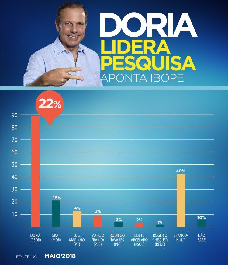
Here is the image replicated using Vega Lite:
Here is the improved version:
The misleading graph was corrected by fixing the y-axis to represent actual percentages and removing exaggerated bar heights, properly sorting bars by real values, and using uniform colors.
Coding Challlenge 5: Scraper. Implement a data scraper of your own
The website UN NEWS was scraped. Collab notebook here.
The UN News website serves as a valuable resource for understanding the key concerns of international policy actors, often reflecting major political and humanitarian issues.
Coding Challlenge 7: Maps
The map displays São Paulo's large-scale health facilities by management type: predominantly municipal scattered troughout the city, with state and private facilities centralized.
Coding Challlenge 8: Big Data – Extracting a story from millions of prices
The graphs below utilize data from the Long Run Prices Database (LRPD).
The dataset merges price and item descriptions based on ID. Prices for Olive Oil and Butter were filtered, categorized by product type. The result is a smaller time-series dataset.This comparison is insightful, as spikes in olive oil prices may lead consumers to opt for less healthy cooking alternatives.
Coding Challenge 9: Analytics Charts
The analytics charts chosen were a bubble plot, displaying the relationship between healthcare expenditure per person and deaths per 100,000 people Brazilian Municipalities, sized by population. It shows a counterintuitive slightly positive correlation between healthcare expenditure and deaths, with a few outliers. It showscases the importance of considering other factors when analyzing healthcare outcomes and can indicate the money is not being spent efficiently.
The second analytics charts chosen was a histogram distribution, displaying the distribution of healthcare expenditure per person in Brazilian Municipalities.
Coding Challenge 10: Interactive Charts
The first chart includes a year slider, while the second chart features a dropdown menu for selecting the series to display.